Gesture Interface Design Project: Recipe App
Introduction:
For this project, it is a gestural interface control service that allow users to interact an app or an interface without physically touching the screen or the object. It uses gestures like hand and body motions. This project is about making “hand free” app on an iphone, so user can feel free to engage with other objects while using the app. A personal goal I had for this project was designing with a clean UI and colors, discover different possibilities for this app, and make a good green screen ‘smoke and mirrors’ video of my app. The goal is to produce a gestural language that is learnable, via an app that also teaches the user how to use gestures. For the purposes of this project, we will assume the iphone will be detecting gestures using its camera and LIDAR sensor to gather 3D depth information.
In this project we used ‘smoke and mirrors’ prototyping. This method is to make something that looks like it actually works just with a mockup prototype. The kind of ‘smoke and mirrors’ this project included was green screen filming with hand gestures, demoing the onboarding and task flows of the recipe app.
Project Timeline: Febuary 21st, 2022 - March 10th, 2022
Tools: Figma, Adobe Premiere Pro, Adobe Dimension, Adobe After Effects, Adobe Photoshop, green screen backgrounds, and cameras.
Project Timeline: Oct 22nd, 2022 - Dec 22nd, 2022
Research Methods: Interviews (include chats etc.), online research, observations of human behavior and gestures (intentional or unintentional), and documentations.
Deliverables: Design Research, low and high fidelity prototypes, style guides, user flow diagrams, UI patterns & design, and ‘smoke and mirrors’ strategy.
‘smoke and mirrors’ prototyping, final design:
This video demonstrates the onboarding process of the recipe app. It shows the instructions of how to use the hand gestures to:
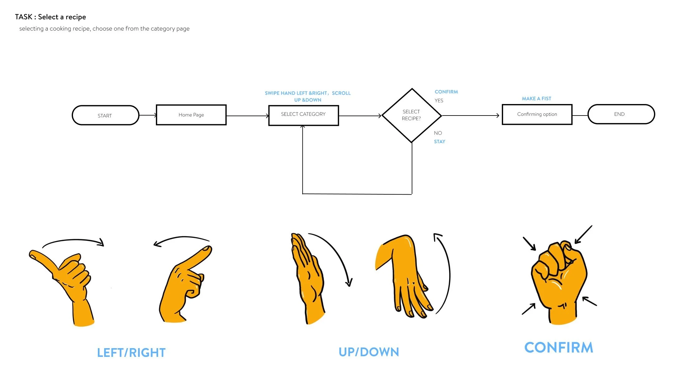
swipe left and right, flip up and down, select/confirm, pause, etc.
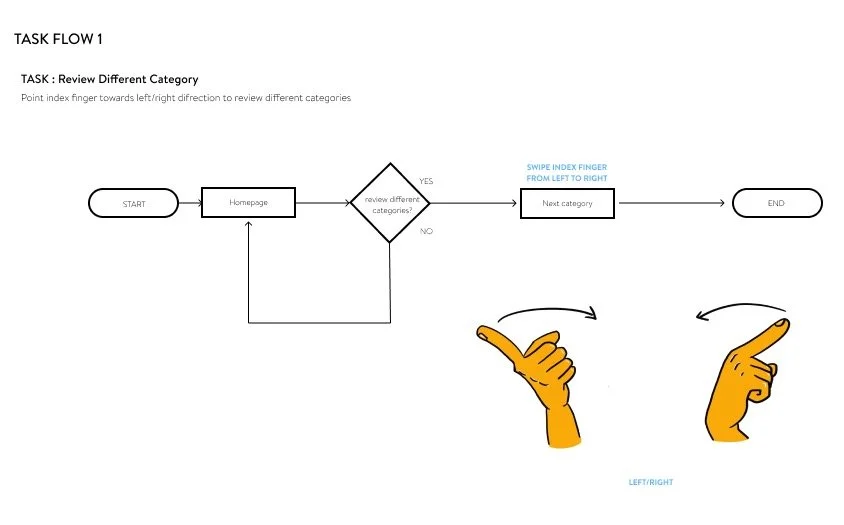
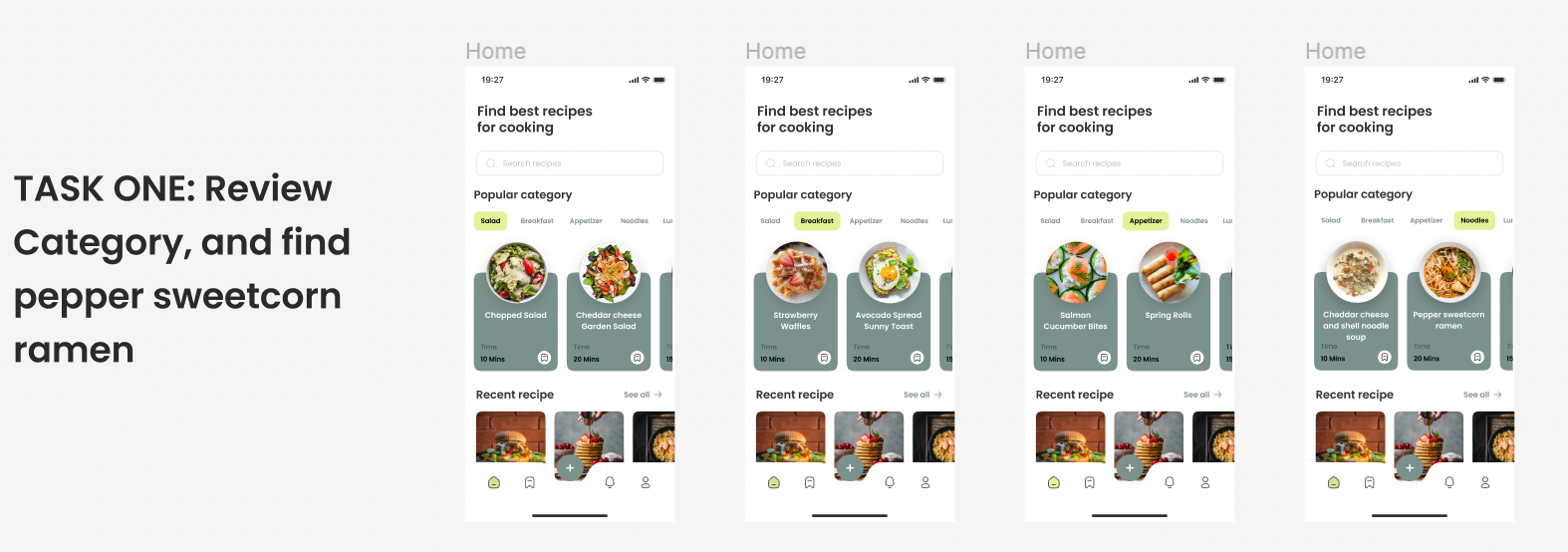
Reviewing categories. In this video user uses index finger and flipping to the right direction, to review all the categories.
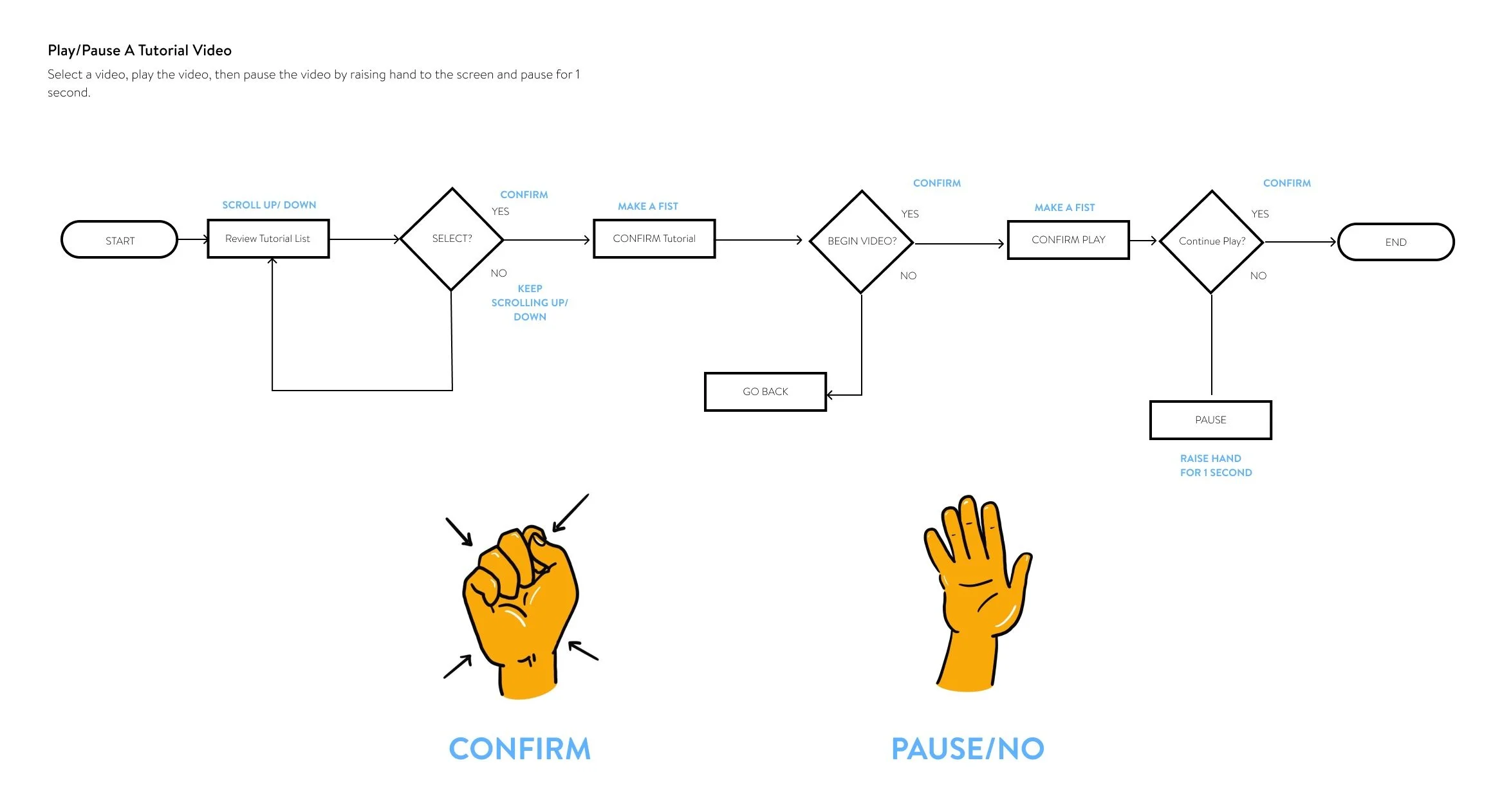
Pause and resume funtion. In this video user raises hand to pause the tutorial video, then raise hand again to resume.
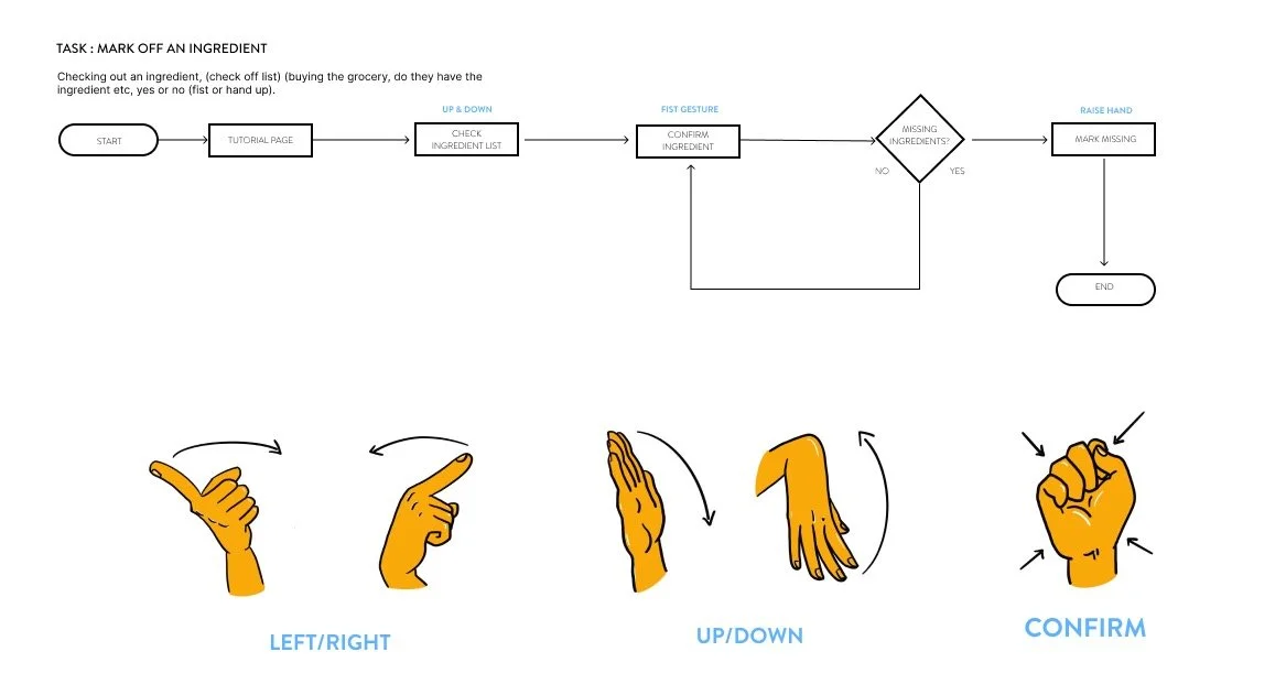
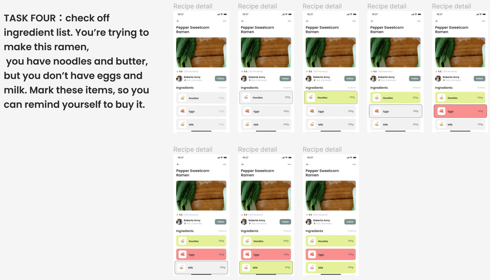
Check off function. This funtion is used as a reminder for the users that what ingredients they have, or needs to buy. In this video it shows the user is raising their hand, or showing a fist to check off the ingredients.
P.S. volume alert!!
Design Process:
People tend to not notice their behavior or the gestures that they make in their daily life. The goal of this Intentional and unintentional gestures exercise was to observe how different people uses variety of hand or body motions that sometimes they’re conscious of, but also sometimes not conscious of.
Intentional and unintentional gestures documentations:
Research:
My first approach to the gestures was designing gestures for, zooming in and out, accepting and rejecting phone calls, voice play features and just use the hand as a mouse to move around the screen. This approach failed because functions like accepting & rejecting phone calls, voice playing features doesn’t make too much sense for this recipe app, it’s kind of going off the topic. The idea of just making the hand to move as a mouse, it might be too tiring for the users.
My first intention of sketches and gesture ideas:
2. Representing Gestures:
Later I received those feedbacks from class, I changed :
1. the mouse like function to just simply moving the hands up & down
2. flipping finger to left & right.
3. I switched the phone call function to ingredient checklist, which user can use the same gestures (fist and palm) to confirm or mark off.
4. Pausing videos, because I suddenly remembered one of the problem that always bothered me was had to pause the video with messy hands all the time while cooking.
5. I also didn’t like just using icons for my gestures anymore, so I drew new hand illustrations in Procreate!
The reason why feedback is important to any interactive system / product, and gestural interface design is becuase it’s difficult to tell if the system or product is working or not, if there’s no feedback saying it. People need constand feedback to complete different tasks.
Echoing feedback means is feedback that shows the user what they’re doing without activating any functions on the interface. In my own design, when user is viewing or hovering different categories, it turns bright green, and the cards turns bigger so the user know which section they’re reviewing currently!
3. Echo and Semantic Feedback :
A user flow diagram is the journey of the user using the app or website etc. to complete different kinds of tasks. It describes the journey steps, but it won’t describe any visually designs of the app or website. It also provides a framework for a series of interactions that happen over time, and what buttons or functions are helpful or not helpful for the design. By creating tasks flows, it allows me to know what should be coming next, or what no longer needs to be used.
The main building blocks / components are :
Rectangular boxes - used to represent something the user does by interacting with the app/service, (What the user does)
Diamond shaped boxes - used to represent a user choice. They are usually conncted by three wires: An input, a YES output, and a NO output.
Round or ‘lozenge’ shaped boxed - used to represent the start or end of a Task.
4. User Flow and Diagramming:
Semantic feedback is giving feedback when user interact with something (eg. buttons), it tells the user have they completed the task successfully or not. The user would know that the system is working properly or gave signal. In my own design, when user selects/confirms an option, it gives feedback with a green color, means they have successfully selected this!
The reason why we designers create wireframes, is as a way to plan and visualize the layout and structure of a digital product, such as a website or app, before moving on to more detailed design elements. Wireframes are low-fidelity representations of the interface that allow designers to focus on the overall user experience, information architecture, and functionality of the product, without getting distracted by aesthetics or visual details.
A wireframe typically includes the basic structure of the page or app, such as the placement of content and navigation elements, and can also include notes or annotations to explain functionality or interactions. What it does not include are visual details such as colors, fonts, or images.
Creating wireframes helps UX designers communicate and iterate on ideas with stakeholders, developers, and other designers, and can help identify potential usability issues early on in the design process. By focusing on the structure and functionality of the product, designers can ensure that the user experience is intuitive, efficient, and effective.
5. Wireframes:
First version of wireframes for the recipe app, made in figma:
2nd version of wireframes for the recipe app, made in figma:
3rd version of wireframes for the recipe app, made in figma:
FINAL Versions:
User Testing with a User Testing Script:
User testing is very important because it helps the designers to improve their designs. To tell where in the design can be confusing, or where are the parts that users can easily understand and likes. If it’s too confusing then most likely your design will not be used by many users. So basically will help improve the user experience, and improve the product development process. The product is being created to improve the lives of real users, and the test results from the user feedback will help to achieve that goal.
It is helpful to plan a user test by writing a user testing script, so I can be ready, have less errors during the interview, and get most information out of the short time of interviewing. It is a realiable way so we don’t skip anything to get the best and true results. But also it should not sound too scripted, and make the interviewees as comfortable as possible, so they don’t feel stressed to talk freely.
Throughout this project I have learned and did a lot gesture research, Echo and Semantic Feedback, Flow Diagramming, UI Patterns, Onboarding process, Wireframing and Mockups, Style Guides, User Testing, Script writing, ‘Smoke and Mirrors’ Green screen filming, and use different applications (Adobe Dimension, After Effects, Adobe Premiere Pro etc.) for editing and creating elements. I feel great about my final design! The strengths of my app are clean UI, easy to learn and understand hand gestures. The video also seems natural and harmonious all together. If I had more time, I would find a better background (like a high resolution picture of a kitchen), to match better with my recipe app. Overall, there were A LOT challenges, but I learned very much new knowledge. this project did made me spend enormous amount of time and effort to complete every tasks and assignment, but it is very worthy. I am proud and feel happy with myself with this project!
Main Takeways:
Add a scroll left screen.
Spell Check! Delete extra words in the Check list function directions, Lower cases.
Video screen- change one middle white to another (maybe like a grey scale, so it’s not the same exact color.
Add a light yellow background to the instruction area, so it’s not just white. To match with the nice yellow hand colors.
Instructions card change to tabs (coming in to the next screen from the bottom).
A style guide is the set of rules of visual design language of the product or web. It provides guidelines for the way of a brand should be presented from graphic and language perspective. A style guide is a tool to better communicate. Instead of spelling out every single design decision, it’s possible for teammates to reference the same guidelines. Once have a style guide, it’s much easier to scale, and build the next designs. It saves a lot time, and decision making on graphic designs.
Color Palette testings:
For my style guide, I first tried generate colors through the www.coolors.co testing with different kinds of color palette to see which color combination looks good and makes sense for my recipe app.
Style Guides:
Then, I picked some color palettes that it could be compatible, and I adjusted later with other colors that I though suits better for my recipe app. I used these color palettes to do low fidelity tests and on high fidelity tests, to actually see how the colors work on my app design, and which variation looks better.
Finally, I decided on a color palette, continue to make icons using the same color pallete, decide on a font that looks perfect for the design, then included my hand gestures!
